Blog - Professional Line Photo Book Review
reviews | by Michael Breitung
Recently I had the opportunity to test the Professional Line Photo Book by Saal Digital. As the name suggests those photo books are high quality products and they come at a price.
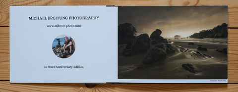
For the test I was able to spend 100 Euro for my photo book design and I went with the following option, which was just a little above that price, coming in at 102,29 Euro: Professional Line 30 x 21, matt photo paper, 52 pages, Acrylic + leather cover (black).
Saal Digital Software
Let's start the review with the software I used to design the book and with some tips. I have used the Saal Digital software for several years now to design my calendars, which I order for Christmas every year. The software exhibits a very clean interface with a browser section on the left side, a design section in the middle and a settings section on the right. At the top you have a toolbar.
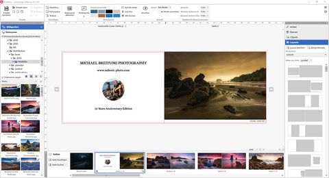
The software made it easy to design the photo book. After the software started, first thing I did was selecting my photo book option from the product selection window. Next I selected the full manual option to give me full control in designing my book. I used drag and drop to place the photos on the different pages, I resized the photos to my liking and with the text tool I added some location information for each photo and gave this text a custom font, size and color. To pick a color I could use a color picker and sample colors from the photos. I was also able to change the order of the pages once I had all my photos placed in the book.
My favorite functionality during the book design was the layout templates section. On the right side you can select from many predefined page templates, which will automatically align images and text on the pages. But the really useful part is that you can create your own templates. For my book I used four different layout templates. To create those I simply designed a double-page and then saved it as a layout, which I then reused for other pages.
Automatic Image Corrections
But within this functionality lies also the biggest danger. If you activate a layout for a double-page, what this also does is, it activate the automatic correction for the photos placed on those pages. In my opinion, activating a layout should never activate any image corrections, because those are completely different functionalities. Especially for a professional photo book, this is the last thing I want.
What makes this worse is the fact that those corrections are hidden within a context menu and I didn't realize I had them active for many of my photos until I received my first book - which looked bad with washed out colors and too bright images.
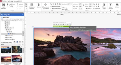
So let my error be a lesson for you: If you use the Saal Digital Software to design any product, make sure to check the context menu for every image and deactivate the automatic image corrections.
What you should rather do is download the ICC Profiles for your product and do necessary adjustments to your photos beforehand and convert them to the required target color space. I have a separate article about print preparation, which you can refer to.
And to Saal Digital I would suggest to add a very visible indicator on the product summary page that tells the customer, if automatic corrections are active for any image. This way unnecessary product reorders could be avoided.
Material
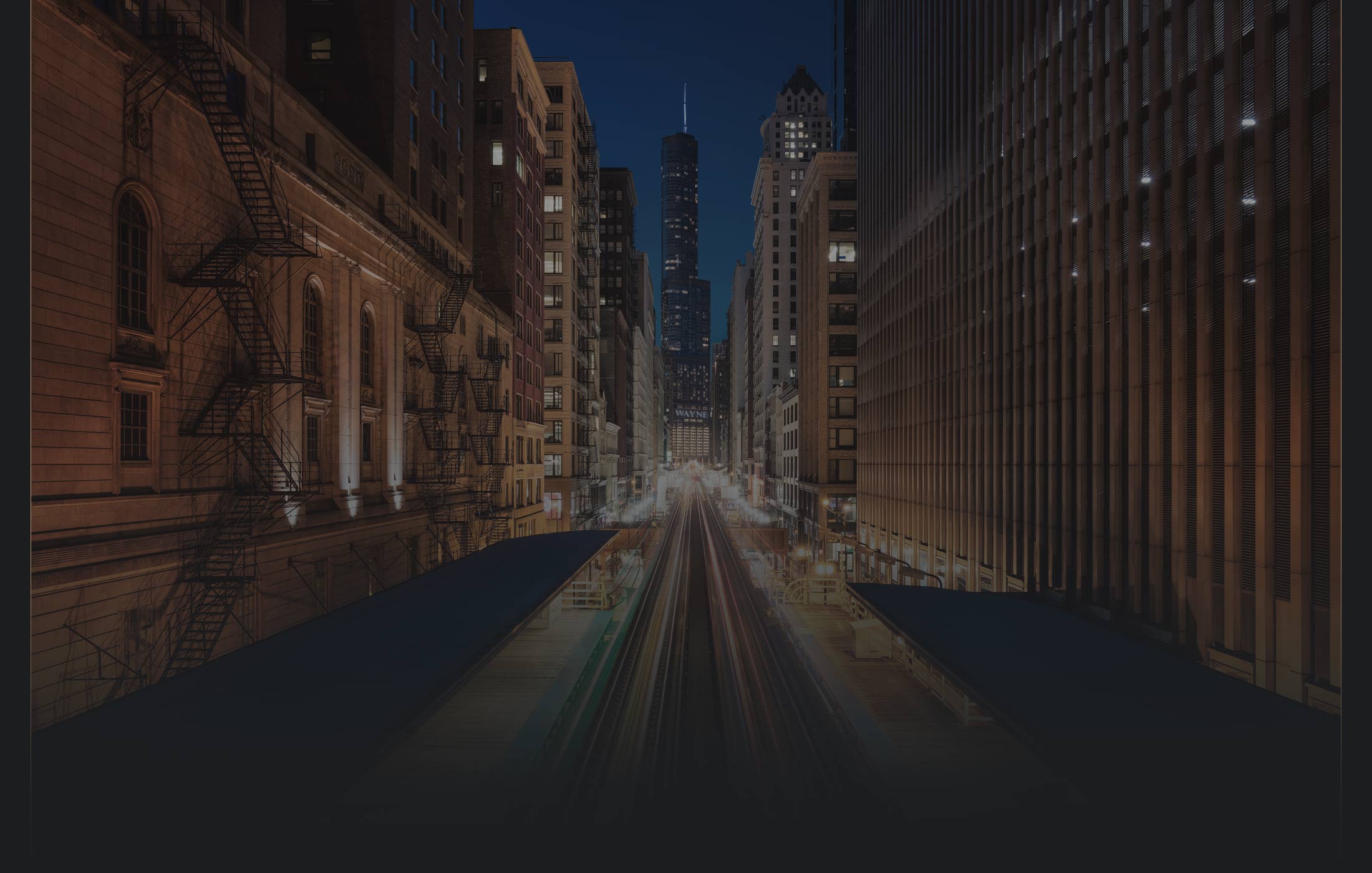
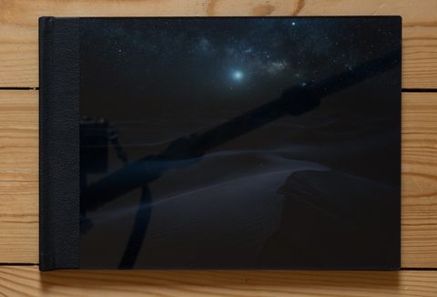
From my reorder to the reception of my second version it took only five days and I could finally focus on the product. The acrylic cover is a great eye catcher for a book and really makes it something special. It's high quality. Mind though that it's also very glossy, which you can see in the image above where my tripod is reflected on the cover.
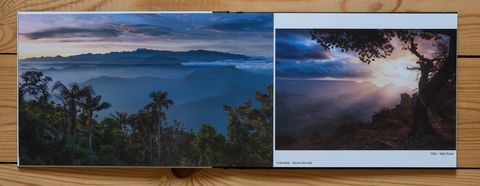
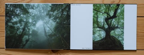
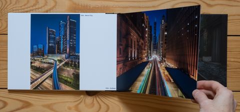
The interior of the book continues in the same high quality fashion. The pages are thick and have a nice feel to them. If I open a double-page it looks like one big, continuous page, which is great for photos that span across page borders.
The matt pages have a very soft - kind of silky - shine to them, which leads to very subtle reflections. So it's not 100% matt, but the reflections are no problem, if I hold the book at a slight angle to the light source.
Print Quality
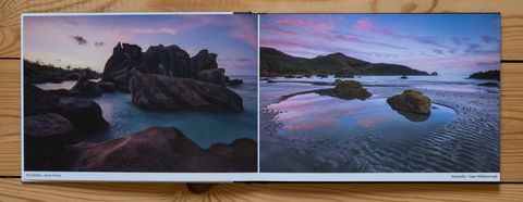
As expected the prints are detailed and show a very good dynamic range. Once I managed to deactivate the automatic color corrections the colors throughout the book were consistent. Again I want to point out that, if you want to get a correct print, you should do soft proofing for your photos beforehand. You might have to add some contrast and saturation as well as do slight color adjustments in that process. A requirement for proper soft proofing is a calibrated monitor, ICC profiles for the selected paper and print process as well as a software like Lightroom that supports soft proofing.
When soft proofing for the matt photo paper I already noticed that the contrasts and colors would be diminished in print, which is quite typical for matt paper. For example, matt paper usually doesn't allow a deep black as shown on a monitor and thus produces less contrast. For more punch I would usually go with glossy paper. But this was not what I was after for this book and what I saw during soft proofing still looked great.
In the printed product though, I found some slight differences to the soft proof. Greens are represented very well and the same is true for Cyanes. But for all other colors and mix-tones I have the impression that the magenta and red parts are a bit subdued. It's not much, but on a few photos it is visible for me. For the calendars and normal prints I regularly order from Saal Digital I never experienced color deviations of that sort between my soft proof and the prints. I would also say that the calendar prints on premium matt paper look better in terms of color and contrast than the prints in the photo book.
What would be ideal for such a premium product would be, if Saal Digital offered the option to get proof prints for individual pages. Then I would have noticed the slight variations beforehand and could have boosted magenta a bit more.
If not proof prints, then a customized color sheet printed on the book paper would be something that would help. This way a customer could manually compare the colors on this sample print with a soft proof for it and find out what adjustments to make. Saal Digital already offers sample sets to inspect the different papers. So I think this should be extended by offering additional color sample sets together with the digital version for manual proofing.
Final Verdict
All in all the Professional Line Photo Book is a solid, high quality product. It looks great, feels great and is a great way to show off my portfolio. But, considering its price, there's also room for improvement. If I were to buy such a book again, I would definitely ask for an option to do some proof prints or to receive a color sample print.